新冠疫情可视化分析
1. 项目准备
1.1. 问题导入
数据可视化,是一种利用计算机图形学和图像处理技术,将数据转换成图像在屏幕上显示出来,再进行交互处理的理论、方法和技术。
本次实践基于丁香园公开的统计数据,实现新冠疫情可视化,包括疫情地图、疫情增长趋势图、疫情分布图等。
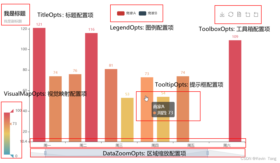
1.2. Pyecharts模块
我们使用的数据可视化模块是Pyecharts,具体使用方法可参考>> Pyecharts 中文手册
- 安装pyecharts
1 | !pip install -i https://pypi.tuna.tsinghua.edu.cn/simple pyecharts |
- pyecharts 配置项
- 系列配置组件
系列配置项 set_series_opts(),可配置图元样式、文字样式、标签样式、点线样式等- 全局配置组件
全局配置项 set_global_opts(),可配置标题、动画、坐标轴、图例等
2. 实验步骤
2.1. 爬取疫情数据
- 爬虫过程
模拟浏览器 → 往目标站点发送请求 → 接收响应数据 → 提取有用的数据 → 保存到本地/数据库
1 | import re |
2.2. 绘制疫情地图
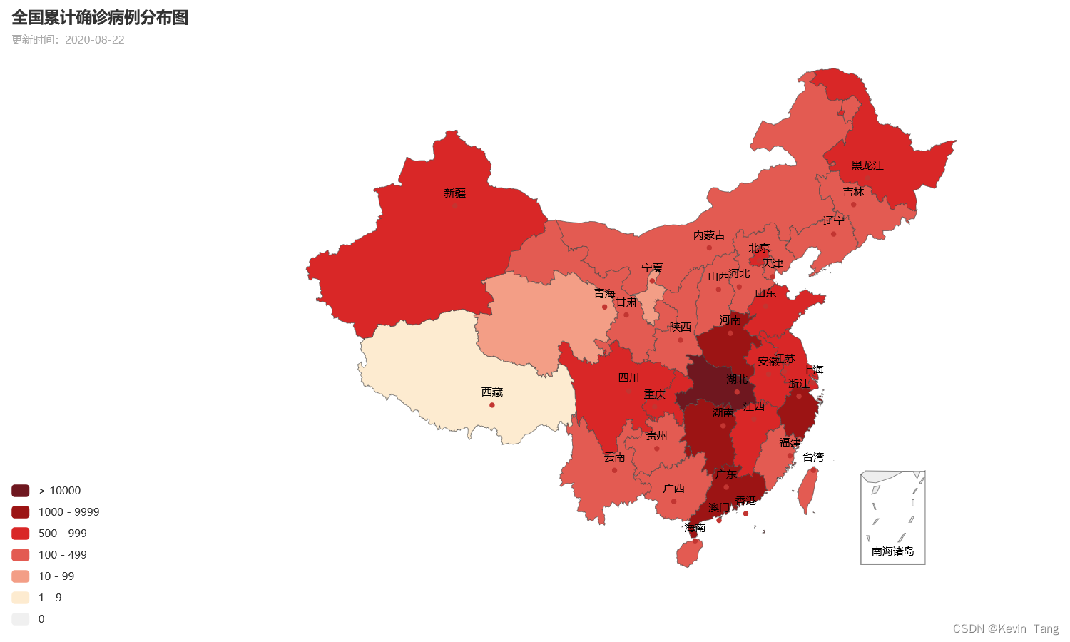
(1) 全国疫情地图
1 | import json |
1 | # ------ 1. 读取初始数据文件 ------ |
代码运行结果如下所示:
1 | 累计确诊: {'香港': 4657, '新疆': 902, '上海': 875, '山东': 830, '台湾': 487, '广东': 1725, '陕西': 360, '四川': 628, '辽宁': 261, '天津': 216, '江苏': 665, '浙江': 1277, '福建': 371, '河北': 354, '云南': 195, '江西': 935, '北京': 935, '内蒙古': 260, '湖北': 68139, '黑龙江': 948, '河南': 1276, '湖南': 1019, '安徽': 991, '重庆': 583, '广西': 255, '山西': 201, '海南': 171, '甘肃': 169, '吉林': 157, '贵州': 147, '宁夏': 75, '澳门': 46, '青海': 18, '西藏': 1} |
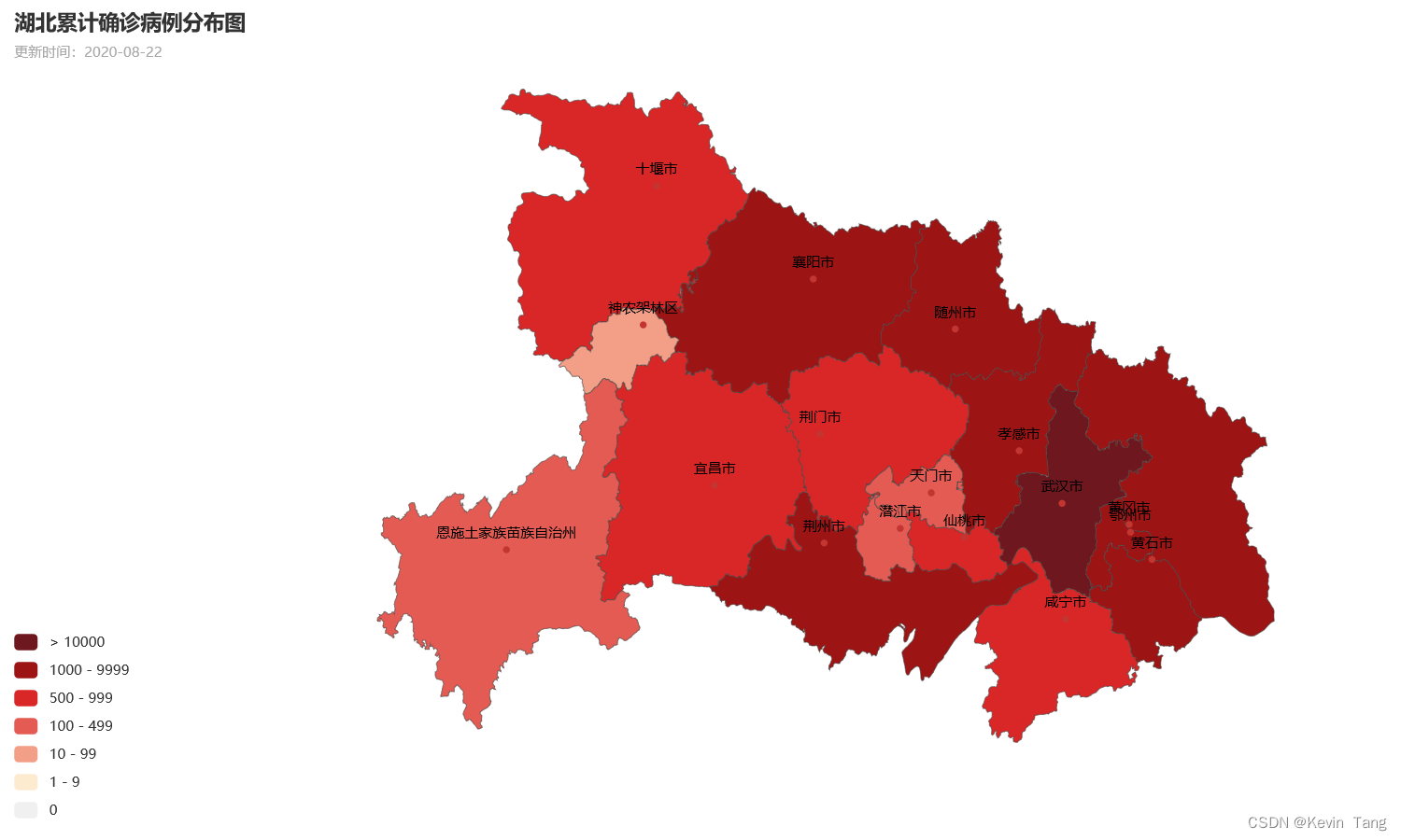
(2) 省级疫情地图
1 | import json |
1 | # ------ 1. 读取初始数据文件 ------ |
代码运行结果如下所示:
1 | 湖北累计确诊: {'武汉市': 50344, '孝感市': 3518, '黄冈市': 2907, '荆州市': 1580, '鄂州市': 1394, '随州市': 1307, '襄阳市': 1175, '黄石市': 1015, '宜昌市': 931, '荆门市': 928, '咸宁市': 836, '十堰市': 672, '仙桃市': 575, '天门市': 496, '恩施土家族苗族自治州': 252, '潜江市': 198, '神农架林区': 11} |
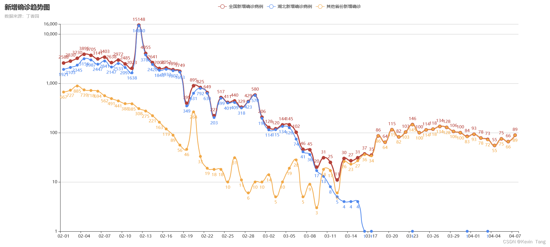
2.3. 绘制疫情趋势图
1 | import numpy as np |
代码运行结果如下所示:
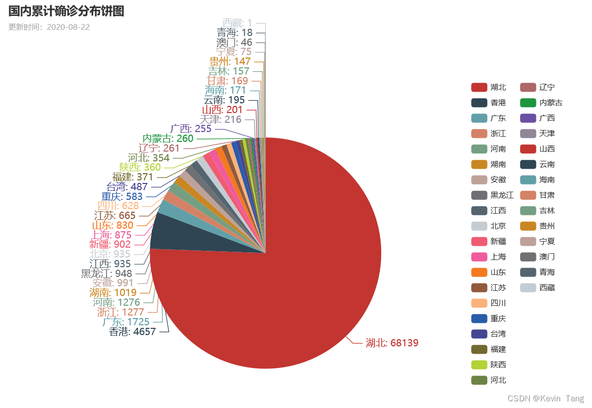
2.4. 绘制疫情分布饼图
1 | import json |
1 | # ------ 1. 读取原始数据文件 ------ |
代码运行结果如下所示:
写在最后
- 如果您发现项目存在问题,或者如果您有更好的建议,欢迎在下方评论区中留言讨论~
- 这是本项目的链接:实验项目 - AI Studio,点击
fork可直接在AI Studio运行~- 这是我的个人主页:个人主页 - AI Studio,来AI Studio互粉吧,等你哦~
本博客所有文章除特别声明外,均采用 CC BY-NC-SA 4.0 许可协议。转载请注明来自 倾珞珈蓝!


评论
ValineTwikoo